Decoded: The Design Psychology
That Makes Brands Look Premium
Ever wonder why some brands stop you mid-scroll — and others get skipped without a second thought? Why one business feels like it charges four figures before you’ve even seen the price, while another looks like it’s permanently running a discount? It’s not budget. It’s not luck. And it’s definitely not some mysterious creative gift that only certain businesses are born with.
It’s design psychology. And once you understand how it works, you’ll never look at a brand the same way again — including your own.
This article breaks down exactly what that job is — and why getting it right is the difference between a brand that gets noticed and one that gets ignored.
"The brands commanding attention, converting browsers into buyers, and attracting premium clients aren't just prettier. They're smarter. Every font, every colour, every image, every pixel of white space is doing a deliberate, calculated job."
Your Brain Makes a Judgement in 0.05 Seconds. Make It Count.
Before a potential customer reads a single word on your website, your packaging, or your social media — they’ve already decided how they feel about your brand. Not consciously. Not deliberately. Their brain just… knows.
That’s design psychology in action. And if you’re a business owner wondering why your brand isn’t converting, isn’t attracting premium clients, or just feels a bit… forgettable — this is where we need to talk.
Because the brands that look expensive? They’re not spending more money. They’re making smarter decisions about brand design.
What Actually Makes a Brand Look Premium?
Let’s break it down. There are five psychological triggers that separate a brand that looks like it charges top-tier prices from one that looks like it’s permanently on sale.
1. White Space (Yes, Empty Space Is Doing Heavy Lifting)
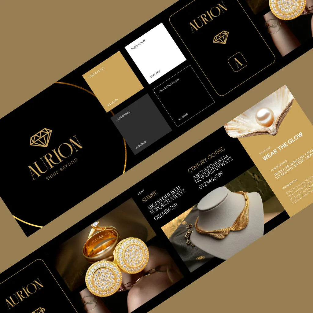
Luxury brands use space deliberately. Space signals confidence. It says: we don’t need to shout. When everything is crammed in — text, images, icons, offers — it creates visual noise, and visual noise reads as cheap. High-end brand identity design breathes. It lets the eye rest. It creates hierarchy, and hierarchy creates trust.
2. Typography That’s Doing the Work
Not all fonts are created equal — and your brain knows the difference even if you don’t. Serif fonts whisper heritage and authority. Clean, geometric sans-serifs communicate modernity and precision. Mismatched fonts, inconsistent sizing, or free Google Font combos that everyone else is using? That’s the visual equivalent of a shaky handshake. Professional graphic design invests in typography as seriously as any other brand asset.
3. Colour Psychology — The Silent Salesperson
Colour is responsible for up to 85% of a purchasing decision. That’s not a design opinion. That’s science. A considered, restrained colour palette with clear psychological intent — that’s what premium brand design looks like. It’s not about using black and gold (lazy shorthand for “luxury”). It’s about understanding what your palette communicates and making every shade intentional.
4. Consistency Across Every Touchpoint
This one’s underrated. A premium brand looks the same on a business card, a website, a product label, a social media post, and a packaging box. That consistency signals professionalism — and professionalism signals trustworthiness. If your visual identity is all over the place, your audience feels it even if they can’t articulate why. Inconsistency erodes confidence in a brand faster than bad reviews.
5. Photography That Earns Its Place
Blurry product photos. Stock images that look like they’re from 2009. Bad lighting. We see it constantly — and it silently destroys an otherwise decent brand. Professional product photography is one of the highest-ROI investments a product brand can make. The right image doesn’t just show your product — it tells your customer exactly who they become when they buy it.
Why Most Brands Get This Wrong
Here’s the uncomfortable truth: most small businesses invest in a logo and think the job’s done. But a logo is the tip of the iceberg. What sits beneath — the brand strategy, the colour psychology, the typographic system, the tone of voice, the photography style, the brand guidelines — that’s where the premium perception actually lives.
When any piece of that puzzle is missing or mismatched, the whole thing falls apart. Clients can’t trust a brand that can’t trust itself.
The Difference Between a Brand That Looks Expensive
and One That Is Valuable
Here’s what’s exciting: design psychology doesn’t just make your brand look more premium. It makes it perform better. Higher perceived value means higher conversion rates. It means clients coming to you already sold. It means fewer “can you do it cheaper?” conversations and more “when can we start?”
This is what strategic brand design actually does. Not just pretty visuals — a system built to communicate value before a single word is read.
Ready to level up?
Your brand should walk into a room and own it.
We create brand identities, graphic design, product photography, and illustration for businesses that refuse to be beige.